Before you start reading, there’s no real “lesson” here. I just thought it would be interesting to explain our thought process for the redesign of our logo and how/why we changed it.
I’ve never really thought the logo of a site mattered a whole bunch. I like a nice logo as much as the next designer, but it’s role in the overall feel of the site is strictly aesthetic. I’m not a designer that preaches that your mark should “brand” your company.
Our logo has been the same since 2007 when I first designed it. I never really changed it because it never bothered me too much. We’ve never promoted “LessEverything” as a company; we’ve always just promoted our products or ourselves.
About a year ago, I started to hate the LessEverything logo (I hated the website, too, but I’ll talk more about that redesign later). The old logo started being painful to look at for one reason or another, and I began to research logos that I liked. I tried to think about why I liked certain ones more than others. I tend to gravitate toward designs that feel timeless. If you look at graphic design over the past 100 years, you’ll obviously see a trend. Design has become nothing more than a series of pixels created with a mouse on a computer using Photoshop.
I love logos, lettering and signage from the early 1900s.

When I see this, I imagine a guy (or gal) taking a pen or a paint brush and creating something—by hand—from a gut feeling. I wanted something reminiscent of that, so when I started looking for a logo designer, I went to Dribbble and found Sergey Shapiro.
A big thing I wanted our logo to subconsciously convey was something handwritten, but not handwriting. Know what I mean? Take the Disney logo for instance. It has the “by hand” look, like it might be a signature, but it doesn’t feel like handwriting.

Once I found Sergey, I emailed him (he’s Russian, but his English is fairly good), and we worked out a price: $1000 for X number of comps.
Side Note: the only part of the process that sucked was paying him through MoneyGram.com, because it’s even worse than PayPal to use.
When Sergey delivered the comps, he delivered more than we agreed upon (which is totally awesome), but having so many choices to pick from made it tougher than we expected.
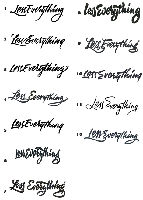
We started the selection process by eliminating ones we just didn’t like at all. They simply didn’t feel right or didn’t fit the image we wanted our company to portray. I don’t know how else to explain it. They just didn’t jive.
After that round of cuts, we had 4 left. The next round were ones that reminded us of other logos or ones that could be easily mistaken for purchased fonts.
We ended up buying 2 designs from him. Yes, we have two logos. Weird, I know.
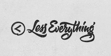
Our company name, LessEverything, makes for a long horizontal logo. The visual length definitely puts constraints on the design of the website, so I ended up only using LESS out of the whole illustration. It just seemed to fit better.

If you wanted it to build a product you’d find a way to get time to work on it. If you really wanted to start that new hobby you’d sacrifice something to find the time and money to do it.
I'll define a "Wannabe Entrepreneur" as someone who has never made money from their businesses. Here are the different types of wannabes.
In the past few years I've built go-carts, built a 200+ sq ft workshop, written several eBooks. How do I create a life where I have time to work on side projects?
Receive 5 Software projects mistakes we have made over the years and how to avoid them.