This blog post is written by Casey Zumwalt of Simple Focus, who created our new logos.
When we start to think about creating a new logo for someone, we begin by trying to narrow down characteristics through some informal conversation.
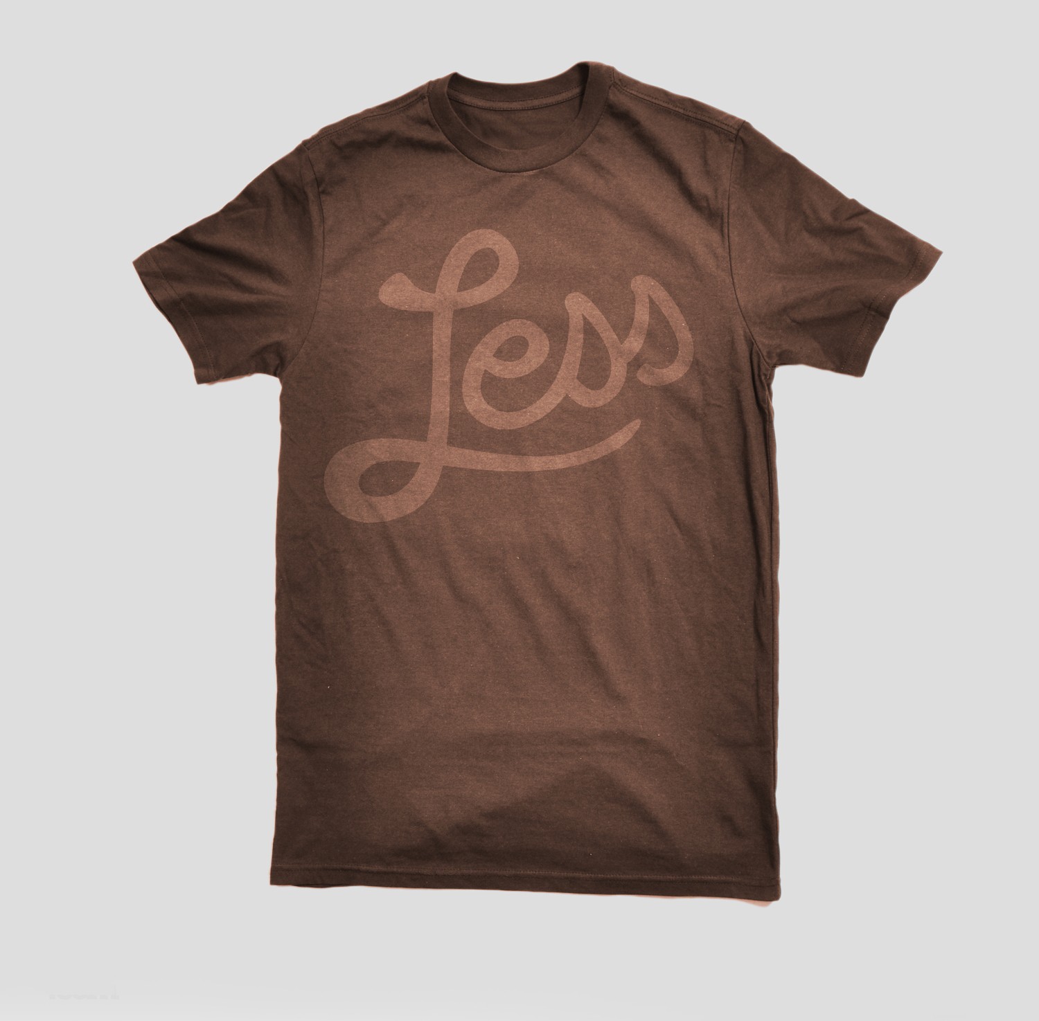
Right from the start it was clear that Allan wanted us to channel the culture of Less in our logo ideas. Managing money is serious business, and most of the time dealing with money management tools is a miserable process. LessAccounting wants to make the process suck less, so the logo needs to be friendly, fun, and as far from hackneyed depictions of accounting-related suckery as possible.
We began feverishly sketching while maintaing a few open-ended conversations about hand-drawn type, MTV logos, costumed sheep, and Mr. T. Let me walk you through the process.
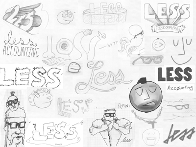
We start with a rigorous brain-dumping exercise we call 20×20s. A 20×20 is twenty ideas in twenty minutes, roughly hammered out on paper in pen, pencil, quill pen, whatever. We time ourselves, and focus intently on the ideas for twenty solid minutes; after this, we’re done thinking about that logo for the day. We don’t share ideas yet, and throw the sketches in a drawer or somewhere out of sight until we’re ready to review them. For Less Accounting, three of us did 20×20s for an entire week. For those of you not using Less Accounting, that’s 300 sketches, which is quite the smorgasbord for any designer to sift through at the end of the week.
The 20×20s really helped us narrow in on a few concepts that were rising to the top. We were really crushing on the hand-drawn type look and feel, and developed a few hilarious characters that found special places in our illustrative heads. 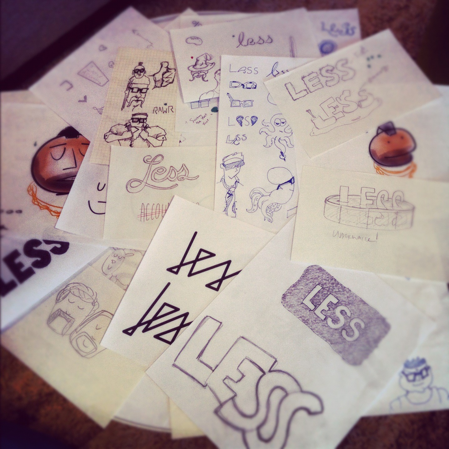
We proceeded to dive head-first into another week of sketching, but this time we were less concerned with ideation and more concerned with iteration. We tried to coerce Allan into being more critical of our ideas, but he’s a nice guy and too open-minded to crush our hopes and dreams.
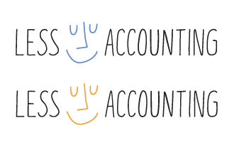
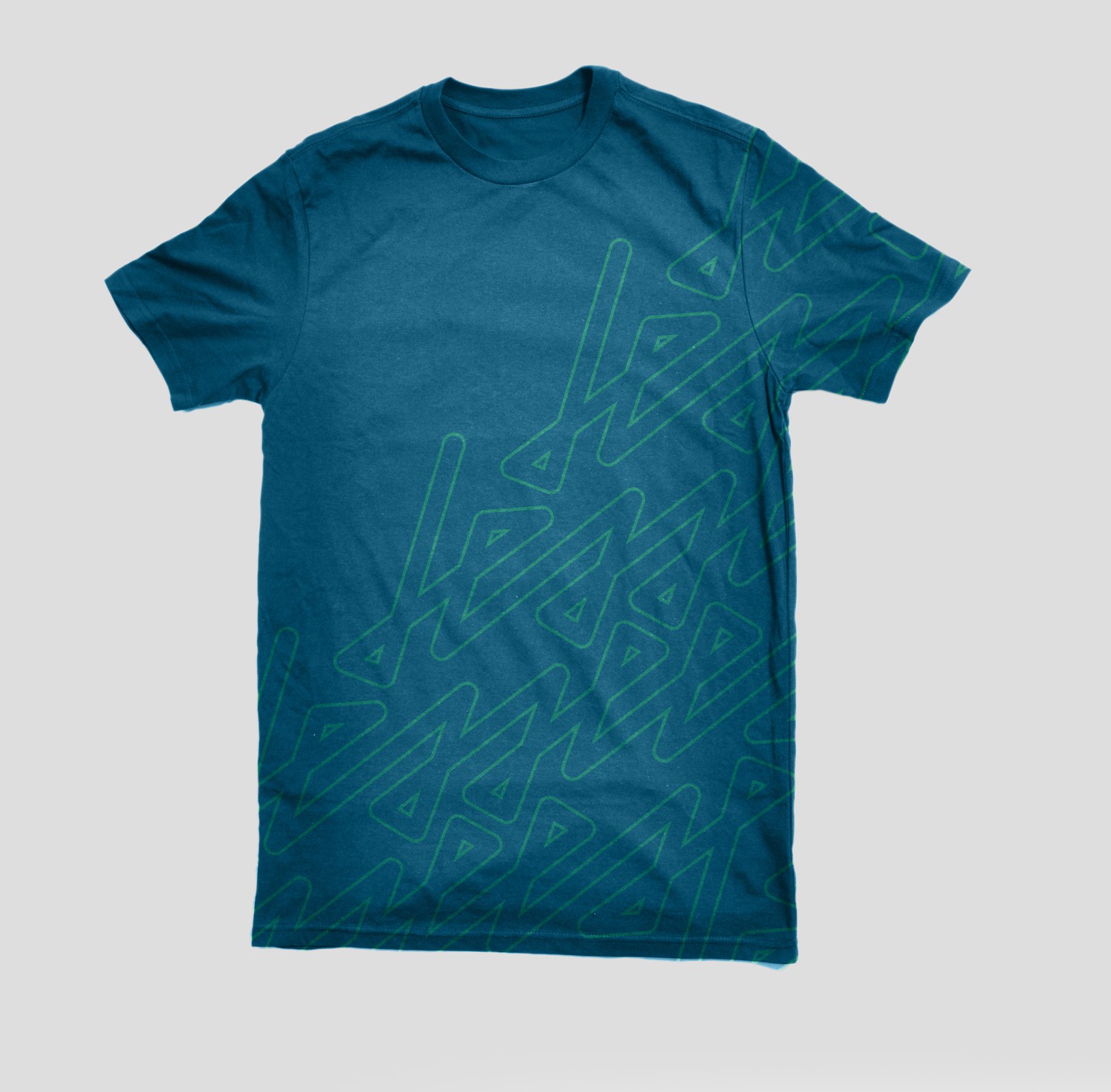
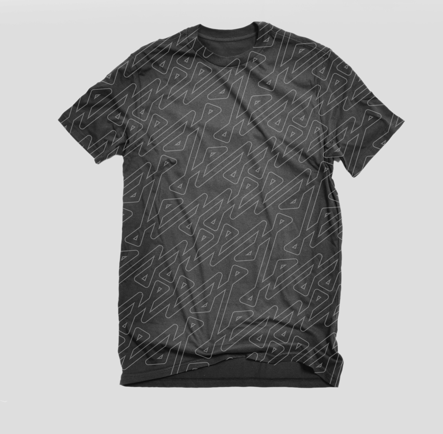
We began to move away from some of the goofier ideas of characters while moving towards the idea of a well-executed type illustration. As we began to work on digitizing these illustrations, we reached out to our friend Reagan Ray at Paravel. Reagan’s great at hand-lettering, and once we decided that’s the style we wanted for this logo, we asked him to talk us through his process. In talking to him we learned a couple of nifty tricks in Illustrator. After digitizing a few of our favorites, we had one last meeting with Allan to deliver final options. Check them out:
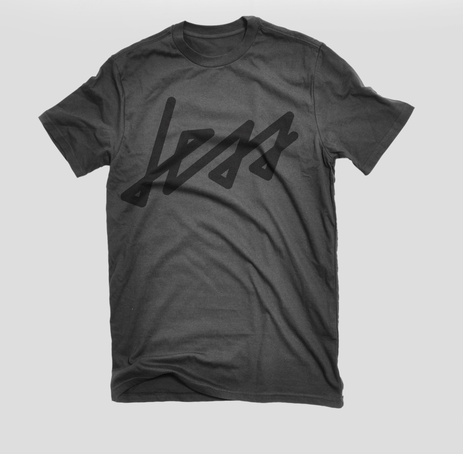
Allan picked our favorite, and we’ve come up with some pretty rad ideas on how to use the other finalists. You might have a chance to get your hands on one of these shirts at LessConf this year!
There are more than a few take-aways from this story, but here are some obvious ones:
Thanks for reading, and we hope you enjoy the new logo as much as we do.
FROM ALLAN: big thanks to Simple Focus for these amazing logos, we’re so happy with them.
__

If you wanted it to build a product you’d find a way to get time to work on it. If you really wanted to start that new hobby you’d sacrifice something to find the time and money to do it.
I'll define a "Wannabe Entrepreneur" as someone who has never made money from their businesses. Here are the different types of wannabes.
In the past few years I've built go-carts, built a 200+ sq ft workshop, written several eBooks. How do I create a life where I have time to work on side projects?
Receive 5 Software projects mistakes we have made over the years and how to avoid them.